Setup
Below is a function that tracks a layer data’s everytime data is assigned inside ggplot_build().
track_layer_data <- function(plot, layer_id) {

  data_assigns <- vapply(ggbody(ggplot2:::ggplot_build.ggplot), function(x) {
    rlang::is_call(x) &&
      !is.null(rlang::call_name(x)) &&
      rlang::call_name(x) == "<-" &&
      rlang::call_args(x)[[1]] == "data"
  }, logical(1))

  inspection_exprs <- lapply(
    ggbody(ggplot2:::ggplot_build.ggplot)[data_assigns],
    function(x) rlang::call_args(x)[[2]]
  )
  names(inspection_exprs) <- paste0("[Step ", sprintf("%02d", which(data_assigns)), "]> ",
                                   ggbody(ggplot2:::ggplot_build.ggplot)[data_assigns])

  ggtrace(
    method = ggplot2:::ggplot_build.ggplot,
    trace_steps = which(data_assigns),
    trace_exprs = inspection_exprs,
    verbose = FALSE
  )
  ggplot2::ggplot_build(plot)
  lapply(last_ggtrace(), `[[`, layer_id)

}
Ignore this if it doesn’t make sense - just know that this is made possible by the {ggtrace} package. You can learn more about it on the package website.
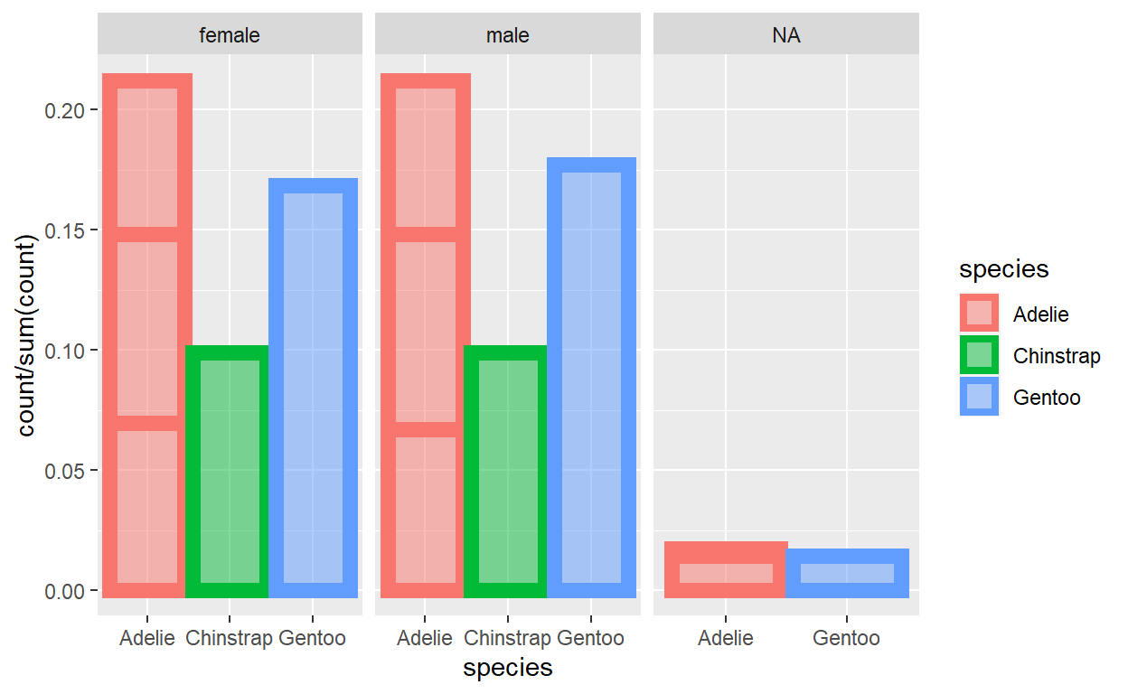
The plot
Here we do some fancy stuff like add a facet w/ free scales, use mapped aesthetics with after_stat() and after_scale(), make some groupings on the spot with interaction(), etc.
barplot_plot <- ggplot(data = palmerpenguins::penguins) +
  geom_bar(
    mapping = aes(
      x = species,
      y = after_stat(count / sum(count)),
      color = species,
      fill = after_scale(alpha(color, 0.5)),
      group = interaction(species, island)
    ),
    size = 3
  ) +
  facet_wrap(~ sex, scales = "free_x")
barplot_plot

Info before diving in
What we’ve tracking is the data everytime it gets updated inside ggplot_build(), the main engine of {ggplot2} that prepares the data for the plot.
You go look at the source code for ggplot_build() on Github or run this from your console:
Using {ggtrace} and our custom track_layer_data() function defined at the top, tracedump holds a snapshot of data as it gets passed around to and from various ggproto objects & their methods.
tracedump <- track_layer_data(barplot_plot, 1)
The last step that we took a snapshot of in tracedump corresponds to the layer’s final data (that’s the data sent off for plotting/rendering to Geom, {grid}, etc.):
identical(
  tracedump[[length(tracedump)]],
  layer_data(barplot_plot, 1)
)
[1] TRUEInspect the data transformation pipeline
Steps are greyed out if data did not change from the previous data-assigning step.
[Step 08]> data <- layer_data
[Step 09]> data <- by_layer(function(l, d) l$setup_layer(d, plot))
[Step 11]> data <- layout$setup(data, plot$data, plot$plot_env)
[Step 12]> data <- by_layer(function(l, d) l$compute_aesthetics(d, plot))
[Step 13]> data <- lapply(data, scales_transform_df, scales = scales)
[Step 17]> data <- layout$map_position(data)
[Step 18]> data <- by_layer(function(l, d) l$compute_statistic(d, layout))
[Step 19]> data <- by_layer(function(l, d) l$map_statistic(d, plot))
[Step 21]> data <- by_layer(function(l, d) l$compute_geom_1(d))
[Step 22]> data <- by_layer(function(l, d) l$compute_position(d, layout))
[Step 26]> data <- layout$map_position(data)
[Step 29]> data <- by_layer(function(l, d) l$compute_geom_2(d))
[Step 30]> data <- by_layer(function(l, d) l$finish_statistics(d))
[Step 31]> data <- layout$finish_data(data)
A final, small {ggtrace} showcase
Change order of bars being drawn
You might have noticed that the bars in the plot are overlapping in odd ways. This actually comes from the way the final state of the data is organized.
barplot_plot

Specifically, take a note of the ordering of rows they’re arranged first by PANEL in ascending order and then y in descending order within each PANEL. Each row represents a bar and the bars are drawn in the order of the rows:
tracedump[[length(tracedump)]] %>%  # again, same as `layer_data(barplot_plot, 1)`
  select(y, group, PANEL)
            y group PANEL
1  0.21220930     1     1
2  0.16860465     2     1
3  0.14825581     3     1
4  0.09883721     4     1
5  0.06976744     5     1
6  0.21220930     1     2
7  0.17732558     2     2
8  0.14825581     3     2
9  0.09883721     4     2
10 0.06686047     5     2
11 0.01453488     2     3
12 0.01744186     3     3
13 0.01453488     5     3
What if we want the bars to be plotted in a order way? Maybe draw all the bars of each species as batches?
We can do that by highjacking ggplot_build() with ggtrace()! We want to do it while we still have access to the values of the species column from th eoriginal data, so Step 26 looks like a good candidate!
ggtrace(
  method = ggplot2:::ggplot_build.ggplot,
  trace_steps = c(27, -1), # right after Step 26 and at the very last step
  trace_exprs = exprs(
    modify = {
      data[[1]] <- data[[1]] %>%
        arrange(PANEL, colour) # Recall that species has been mapped to `colour`
      data # we return `data` for logging to the `last_ggtrace()` tracedump
    },
    inspect_final = data
  ),
  verbose = FALSE
)
barplot_plot
Woop! Now the bars are drawn in the order of Adelie -> Chinstrap -> Gentoo!
Don’t believe me? Here’s the ordering of rows in the data that we modified right after Step 27 was ran:
last_ggtrace()[["modify"]][[1]] %>%
  select(group, PANEL)
   group PANEL
1      1     1
2      3     1
3      5     1
4      4     1
5      2     1
6      1     2
7      3     2
8      5     2
9      4     2
10     2     2
11     3     3
12     5     3
13     2     3
And here’s how that injection changed the final output of what was returned by ggplot_build(). Compare this with what we had above. Again, pay attention to the ordering of the rows!
last_ggtrace()[["inspect_final"]][[1]] %>%
  select(y, group, PANEL)
            y group PANEL
1  0.21220930     1     1
2  0.14825581     3     1
3  0.06976744     5     1
4  0.09883721     4     1
5  0.16860465     2     1
6  0.21220930     1     2
7  0.14825581     3     2
8  0.06686047     5     2
9  0.09883721     4     2
10 0.17732558     2     2
11 0.01744186     3     3
12 0.01453488     5     3
13 0.01453488     2     3
Target a calculated grouping
Remember how we passed interaction(species, island) to aes(group = )? Because the groupings were calculated on the fly in this way, we don’t have a way of singling out something like the middle bar of Adelie in the male facet.
OR DO WE???
We can highjack ggplot_build() once again, this time right before it returns the final data for the layer. We know the top-left bar is the third group (descending order of y) of the second panel, so we can just grey out all other bars (and also plot that one bar at the top / move it to the last row).
ggtrace(
  method = ggplot2:::ggplot_build.ggplot,
  trace_steps = c(-1),
  trace_exprs = quote(data[[1]] <- local({
    layer1 <- data[[1]]
    target_pos <- layer1$group == 3 & layer1$PANEL == 2
    layer1$colour <- replace(layer1$colour, !target_pos, "grey")
    layer1$fill <- replace(layer1$fill, !target_pos, alpha("grey", 0.5))
    layer1[c(which(!target_pos), which(target_pos)),]
  })),
  verbose = FALSE
)
barplot_plot
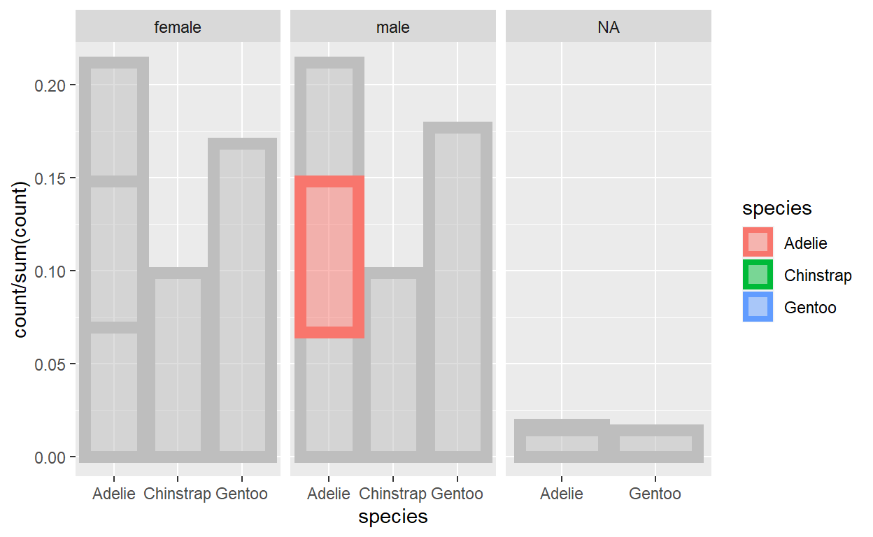
:D
By the way, all of these modifications are ephemeral because ggtrace() has once = TRUE by default (as you might have guessed, you can turn that off with once = FALSE and create a persistent trace, which you can then later remove with a call to gguntrace()).
So if we render the plot again, ggplot_build is ran with its normal behavior:
